
This document defines the shared vocabulary and final layout architecture for Seed frontend app surfaces. It describes the desired system as the stable reference point for new features, layout refactors, and AI-agent implementation work.
If you want to check the current app layout state, you can see it here.
Core Vocabulary
Platform Shell
A platform shell is the outermost app frame owned by a specific runtime.
Seed has two platform shells:
DesktopShell for Electron-specific app chrome and local runtime affordances.
WebShell for browser and Remix-specific app chrome.
The platform shell owns runtime integration. It does not own feature content.
App Frame
The app frame is the shared layout boundary inside a platform shell. It provides the structural contract that feature routes render into.
The app frame owns:
Route viewport sizing.
Main content boundaries.
Optional route right panel placement.
Shared route-level action slots.
Intentional scroll containers.
Route Frame
A route frame is the reusable layout component used by a route when it needs a main content area and optional contextual right panel.
A route frame has two regions:
RouteFrame
  MainContent
  RightPanel?      optional
Routes render content into MainContent and provide panel descriptors for RightPanel.
Main Content
Main content is the primary route surface. It is the only region where route body content renders.
Examples:
Document content.
Feed.
Library.
Notifications.
Settings.
Agents.
Right Panel
A right panel is contextual UI attached to the active route.
Examples:
Comments.
Activity.
Directory.
Collaborators.
Document options.
Document versions.
Inspector/debug details.
Right panels are optional, route-addressable when their state affects navigation, independently scrollable, and resizable on desktop-class layouts.
App Panel
An app panel is a platform-level panel outside the route frame.
Example:
Desktop assistant panel.
App panels are not route right panels. They are owned by the platform shell.
System Layers
Seed frontend layout is organized into three layers.
Platform Shell
  App Frame
    Route Frame
      Feature Content
Platform Shell Layer
The platform shell layer owns runtime-specific chrome and capabilities.
Desktop shell responsibilities:
Electron window chrome.
Titlebar and native window controls.
Desktop sidebar.
Footer/status affordances.
Assistant app panel.
IPC-backed platform actions.
Web shell responsibilities:
Remix root document integration.
Server/client route loading boundaries.
Site host banners.
Web-only header/actions.
Browser navigation integration.
Platform shell code provides platform capabilities to shared code through adapters, context, or explicit props. Shared layout code does not import Electron APIs, Remix loaders, or browser-only globals directly.
Shared App Layout Layer
The shared app layout layer owns structure that behaves the same across platforms:
App frame.
Route frame.
Main content scroll container.
Optional right panel.
Panel headers and close affordances.
Panel sizing and persistence interfaces.
Route action slot placement.
Layout-level responsive behavior.
Shared app layout lives in @shm/ui and remains feature-agnostic.
Feature Layer
Feature code owns route content and feature state:
Documents.
Feed.
Comments.
Activity.
Directory.
Collaborators.
Settings.
Agents.
Notifications.
Feature code does not recreate platform shells or app frames. It provides content, actions, and optional right-panel descriptors to the shared layout layer.
Layout Regions
Desktop Layout
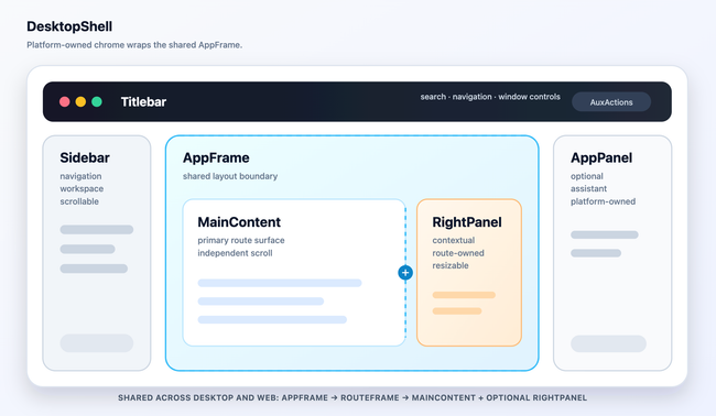
Desktop-specific shell regions are Titlebar, Sidebar, and AppPanel. The shared region is AppFrame.
Web Layout
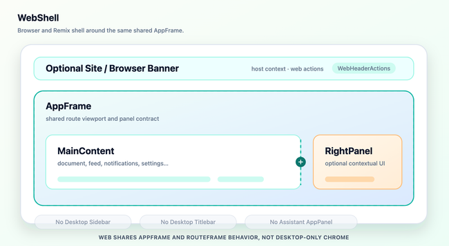
Web does not implement the desktop sidebar, titlebar, or assistant app panel. Web still uses the shared AppFrame and RouteFrame concepts for main content and right-panel behavior.
Code Organization
The shared layout system uses these conceptual modules:
@shm/ui
  app-frame
    AppFrame

  route-frame
    RouteFrame
    RouteFrameMain
    RouteFramePanel
    RouteFrameActions

  resizable
    ResizableGroup
    ResizablePanel
    ResizableHandle
    PanelSizeStorage

  shell-slots
    ActionSlot
    HeaderSlot
    PanelSlot
Platform apps compose those modules through platform-owned wrappers:
frontend/apps/desktop
  DesktopShell
  DesktopTitlebar
  DesktopSidebar
  DesktopAssistantPanel
  DesktopPlatformProvider

frontend/apps/web
  WebShell
  WebSiteBanner
  WebHeaderActions
  WebPlatformProvider
Feature routes consume the shared layout through stable imports from @shm/ui.
Route Contract
A route provides content and optional slots. It does not manage shell structure.
Canonical route shape:
<RouteFrame panel={panelDescriptor} actions={routeActions}>
  <RouteContent />
</RouteFrame>
The RouteFrame contract:
export type RouteFramePanel = {
  key: string
  title: string
  content: React.ReactNode
  width?: PanelSize
  minWidth?: PanelSize
  maxWidth?: PanelSize
  onClose?: () => void
}

export type RouteFrameProps = {
  children: React.ReactNode
  panel?: RouteFramePanel | null
  actions?: React.ReactNode
}
Routes own:
Data loading and feature state.
Feature-specific providers.
Route-specific actions.
Choosing the active right panel.
Rendering panel content.
The route frame owns:
Main/right-panel split.
Panel header placement.
Close affordance placement.
Resize handle placement.
Scroll behavior.
Responsive behavior.
Slot layout.
Right Panel Contract
Right panels are described as data plus content.
export type RightPanelDescriptor = {
  key: string
  title: string
  content: React.ReactNode
  routeState?: unknown
  size?: PanelSize
  minSize?: PanelSize
  maxSize?: PanelSize
}
Rules:
key identifies the panel type.
title is displayed by the shared panel header.
content is feature-owned.
Navigation-relevant panel state is encoded in shared route state.
Ephemeral panel state, such as width, is persisted through panel-size storage.
Panel content scrolls independently from main content.
Resizable Layout Contract
Resizable behavior is exposed through Seed-owned layout primitives, not directly through third-party panel libraries.
<ResizableGroup direction="horizontal" storageKey="document-route">
  <ResizablePanel id="main" minSize={50}>
    <MainContent />
  </ResizablePanel>

  <ResizableHandle />

  <ResizablePanel id="right-panel" minSize={20} maxSize={50} collapsible>
    <RightPanel />
  </ResizablePanel>
</ResizableGroup>
Resizable layout rules:
Panel sizes are explicit percentages or named presets.
Panel size persistence is injected through a small storage interface.
Nested panel groups are scoped by group identity.
Route code does not call imperative resize methods.
Collapse and restore behavior is represented as layout state.
Complex coordination uses a local state machine inside the resizable layout implementation.
Scroll Model
Seed app layout uses intentional scroll containers.
Rules:
Platform root fills the viewport.
Platform shell does not scroll.
App frame does not scroll.
Route frame does not scroll.
Main content scrolls.
Right-panel content scrolls.
Sidebar content scrolls on desktop.
App panels scroll internally when their content overflows.
Required Tailwind layout patterns:
h-screen
h-full
min-h-0
min-w-0
overflow-hidden
overflow-y-auto
shrink-0
flex-1
Every flex child that contains a scroll region includes min-h-0. Every horizontal flex child that contains route content includes min-w-0.
Platform Capability Boundary
Shared layout code accesses platform behavior through a platform capability interface.
export type PlatformLayoutCapabilities = {
  platform: 'desktop' | 'web'
  openExternalUrl?: (url: string) => void
  windowControls?: {
    minimize(): void
    maximize(): void
    close(): void
  }
}
Rules:
Platform capabilities are optional unless a platform wrapper requires them.
Shared layout components guard optional capabilities.
Shared layout components do not import Electron modules.
Shared layout components do not import Remix server APIs.
Browser globals are accessed at platform edges or through injected callbacks.
UI Primitive Boundary
The app/layout scaffold consumes UI through @shm/ui public wrappers.
Rules:
Feature and layout code import UI components from @shm/ui.
Feature and layout code do not import Radix, React Aria, or Ariakit directly.
Primitive-library choices remain hidden behind @shm/ui wrappers.
Layout architecture and primitive implementation are separate concerns.
This boundary allows the UI primitive implementation to evolve without changing the app/layout architecture vocabulary.
Naming Rules
Use these names consistently:
PlatformShell for runtime-owned outer shell concepts.
DesktopShell for the Electron shell.
WebShell for the browser/Remix shell.
AppFrame for the shared platform-inside layout boundary.
RouteFrame for a route's main content plus optional right panel.
MainContent for the primary route body.
RightPanel for contextual route UI.
AppPanel for platform-level side panels such as the assistant.
ResizableGroup, ResizablePanel, and ResizableHandle for Seed-owned resizing primitives.
Avoid using panel without a qualifier in new architecture docs or public APIs. Prefer RightPanel, AppPanel, or ResizablePanel.
Architecture Decisions
Seed shares the app frame and route frame across desktop and web.
Seed does not force desktop-only chrome into the web app.
Platform shells own platform chrome and runtime integration.
Feature routes provide content and slots; they do not recreate shell layout.
Right-panel identity is route-addressable when it affects navigation.
Panel dimensions are persisted separately from route identity.
Resizable behavior is hidden behind Seed-owned layout primitives.
UI primitive libraries are hidden behind @shm/ui wrappers.
Document-content styling is outside the app/layout scaffold.
Guidance for Developers and AI Agents
Before implementing layout-related work:
Name the layer being changed: platform shell, shared app layout, or feature.
Use the vocabulary in this document.
Prefer adding a slot or descriptor over duplicating layout structure.
Keep scroll containers explicit.
Keep route state and ephemeral layout state separate.
Do not combine primitive implementation changes with app/layout scaffold work.
Update this document when the vocabulary or final architecture changes.
Do you like what you are reading? Subscribe to receive updates.
Unsubscribe anytime