


Problem Statement
Our documents support embedding content from other documents (embeds). Currently, embeds are visually denoted with a green vertical bar on the left side of the content, similar to a blockquote style. This approach has three key problems:
Looks like a blockquote — The green left border is visually identical to how blockquotes are styled across the web, confusing the semantic meaning of embedded content.
Not informative about the source — There is no indication of where the content comes from. Users cannot see the source document title, author, or any attribution without interacting.
Disrupts reading flow — The continuous left border, especially for longer embeds, creates visual noise and breaks the natural reading rhythm.
Constraints
Users can navigate to the source document and expand/collapse embeds
Visual treatment should be the same in both reading and editing modes
Embeds can be any length — from a single paragraph to an entire document
Three existing view modes: Content (inline), Card (summary), and Comments
Current Design
The current implementation uses a 3px green left border (border-l-primary border-l-3 in Tailwind) applied via the EmbedWrapper component.
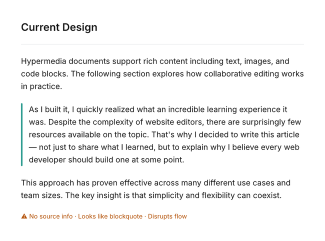
The green bar provides a visual cue that content is different, but it fails to communicate what that content is or where it comes from. It also creates a visual pattern that's indistinguishable from blockquotes.
Proposed Alternatives
Option A — Attribution Header
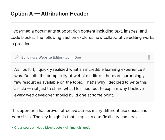
Replace the green bar with a compact header bar above the embedded content, showing source document info.
How it works
A small header displays the source document's icon, title, author, and a collapse chevron
The header is clickable — navigates to the source document
The embedded content below has no border or special styling — it reads naturally
The container uses a very subtle background (#FAFAFA) with rounded corners to define boundaries
The expand/collapse chevron is integrated into the header
Pros
Clear source attribution — solves the "where is this from?" problem
Doesn't look like a blockquote — distinct visual pattern
Minimal reading disruption — content itself has no special styling
Familiar pattern (Notion synced blocks, GitHub embeds, Slack previews)
Natural home for the expand/collapse control
Works well for any embed length
Cons
Takes vertical space for the header row
Nested embeds could create visual clutter with stacked headers
Option B — Background Tint + Inline Attribution
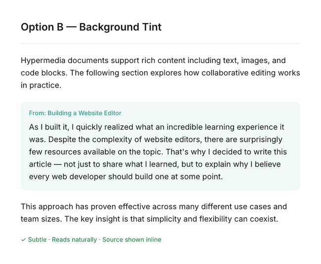
Use a very subtle background color with a small source label to differentiate embedded content.
How it works
A very soft green tint (brand color at ~5% opacity) fills the embed area
A small "From: Document Title" label appears at the top in the brand color
A soft rounded border defines the embed boundaries
Content reads almost like normal text with just a hint of differentiation
Pros
Lightest visual weight of all options
Content reads very naturally — minimal disruption
The tint provides a subtle but persistent visual cue across any length
Source attribution is present but unobtrusive
Cons
May be too subtle for some users to notice at a glance
Background tint can clash with dark mode if not carefully calibrated
Less discoverable than a header approach
No natural place for expand/collapse controls
Option C — Margin Indicator + Hover Attribution
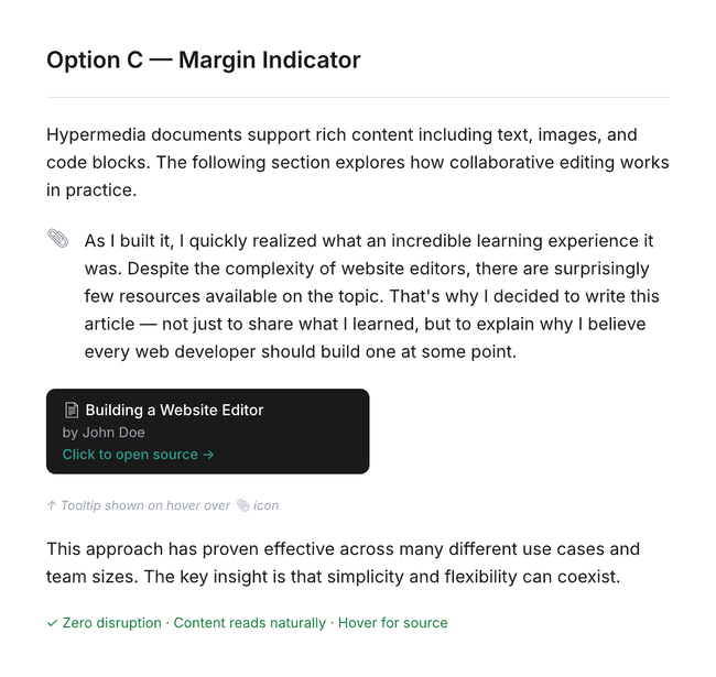
Place a small icon in the left margin with source info revealed on hover. Zero visual disruption to the content.
How it works
A small link/clip icon sits in the left gutter (where collapse chevrons already exist)
The embedded content has no border, no background — visually identical to regular text
Hovering over the margin icon reveals a dark tooltip showing: source title, author, and "Open source" link
Clicking the icon navigates to the source document
Pros
Zero reading disruption — content is indistinguishable from native text when scanning
Minimalist approach that respects the reading experience above all else
Uses existing gutter space (where collapse chevrons already live)
Cons
Low discoverability — users must know to look for or hover the icon
Not obvious that content is embedded until the user interacts
May cause confusion when users copy text without realizing it's from another document
Tooltip-based attribution is invisible to screen readers
Option D — Bookend Dividers with Source Tag
Use thin horizontal lines above and below the embed, with source attribution inline in the top divider.
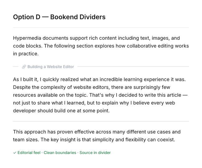
How it works
A thin horizontal line appears above the embed with the source document title embedded inline
The content between the lines has no special styling
A simple thin closing line marks the end of the embed
Clicking the source title navigates to the source document
Pros
Very clean, editorial feel (similar to citations in academic papers)
Clear start and end boundaries without a continuous border
Source attribution is visible without interaction
Works well at any embed length — the lines don't create visual weight like a continuous bar
Cons
Horizontal lines add visual noise if many embeds are stacked consecutively
The editorial style may feel out of place in a more casual document
Less clear boundary for very short embeds (1-2 lines)
Recommendation
Option A (Attribution Header) offers the strongest balance across all
three problems:
Clear source attribution (solves problem 2)
Distinct visual pattern that's not a blockquote (solves problem 1)
Content itself has no special styling, preserving reading flow (solves problem 3)
A possible hybrid approach (A + B) could combine the header for attribution with a very subtle background tint for longer embeds, making boundaries clearer when the content spans many paragraphs.
Next Steps
Review mockups and gather team feedback on preferred direction
Build a prototype of the top 1-2 options in the actual editor
Test with real document content at various embed lengths
Evaluate dark mode behavior
Ship as an experiment behind a feature flag
Do you like what you are reading? Subscribe to receive updates.
Unsubscribe anytime