Hosted onhoraciohdev.dev.hyper.mediavia theHypermedia Protocol

Rich Text Editing Inspirations

Apps to review:

    Notion

    Coda ✅

    Slite ✅

    Obsidian

    Craft

    Latest version of Blocknote

    Prosekit

Slite inline comment UX

Slite’s inline comment experience feels lightweight, contextual, and conversation-oriented. The interaction is built around selecting text, adding a comment from the floating editor toolbar, and keeping the discussion visually close to the annotated content. The overall impression is that comments are not treated as a separate review layer, but as part of the collaborative writing experience. Interaction Flow UX Pattern Pattern name: Inline embedded comment thread The main characteristic of this pattern is that the comment does not live in a detached sidebar. It appears close to the relevant text, making the relationship between the content and the discussion immediately clear. What Works Well The proximity between the selected text and the comment composer is strong. The user does not need to mentally connect a highlight with a distant thread elsewhere on the screen. The comment creation flow is simple: select text, choose comment, type, submit. It fits naturally into the existing editing interaction because the comment action appears alongside formatting controls. The inline placement also makes comments feel like part of the document collaboration process rather than a separate mode. This can be especially useful for team writing, feedback, drafting, and async discussion. Potential Friction Because the comment appears inline or very close to the text, it can add visual weight to the document. If many comments are open or unresolved, the reading experience could become cluttered. The comment feature also depends on text selection, so users who do not already know that comments are available may not discover it immediately. Another possible issue is scalability: short comments feel lightweight, but long threads or multiple comments near the same area could interrupt the rhythm of the document. Design Takeaways Slite’s approach is especially good when comments are meant to feel immediate, contextual, and conversational. Ideas worth borrowing: Inspiration for Seed For Seed, this pattern could work well for lightweight discussion around specific text fragments, especially when the goal is to keep conversations close to the content they reference. The main thing to be careful with is document clutter. If Seed supports many comments, it may need collapsed states, hover states, or a separate review mode so comments do not overwhelm the reading experience.

Linear Docs ✅

Google Docs ✅

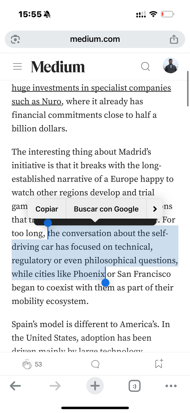
Medium Mobile sucks!

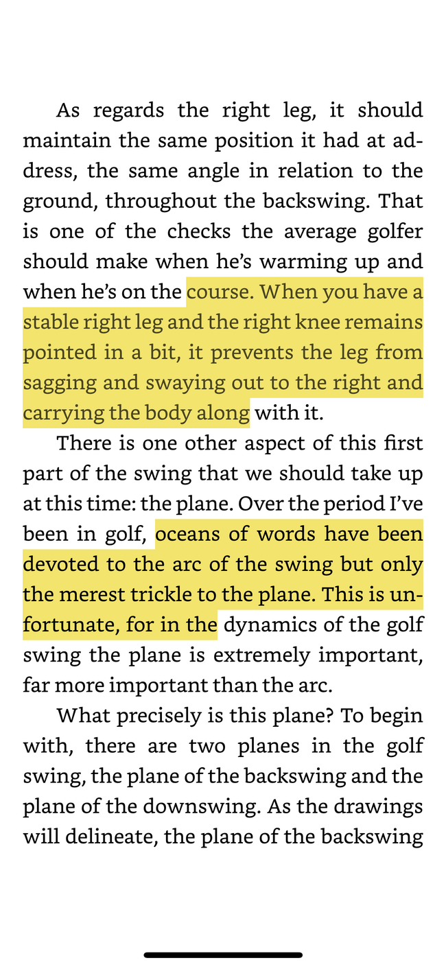
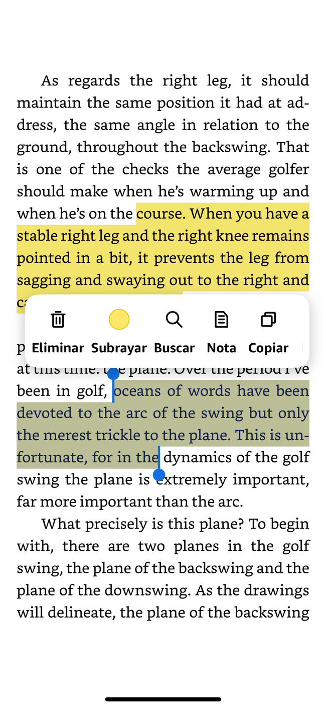
Kindle Interaction is interesting:

    First, you highlight

    Then you click on the highlight, and you get the options


Do you like what you are reading? Subscribe to receive updates.

Unsubscribe anytime