

Problem
On mobile, the current floating formatting toolbar is partly hidden and trying to click on its' buttons completely hides it. Also, the slash menu is also broken. It's transparent and all over the place, making it hard to click the necessary block type.
This creates a frustrating experience when trying to format or insert content on mobile.
Solution
Introduce a static/sticky toolbar for mobile, replacing the current floating formatting toolbar as the primary formatting control.
Proposed approaches
Static toolbar on top of the comment box
Always visible on top of the box but maybe can still be hidden by the mobile keyboard
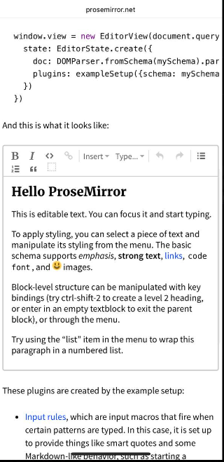
Sticky header toolbar
Fixed under the app header.
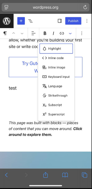
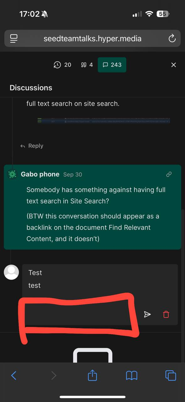
Compact bottom toolbar + expandable “More” menu
Minimal row with some core actions at the bottom of comment box.
A button that opens a menu with more options.
Concerns and questions
Slash menu integration: Should the slash menu be merged into the new toolbar or should we fix the existing transparent menu?
Keyboard handling: iOS Safari often breaks position: fixed when the keyboard is open. Better to use position: sticky and place the toolbar below the header?
Which buttons should be in the toolbar.
Difference between iOS/Android browsers.
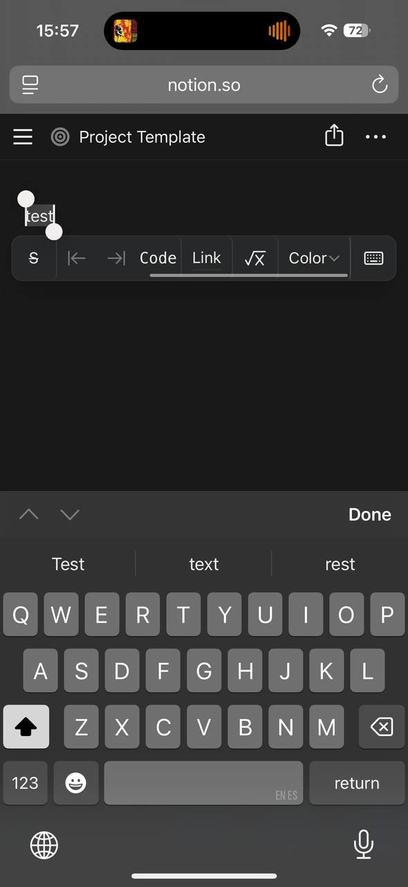
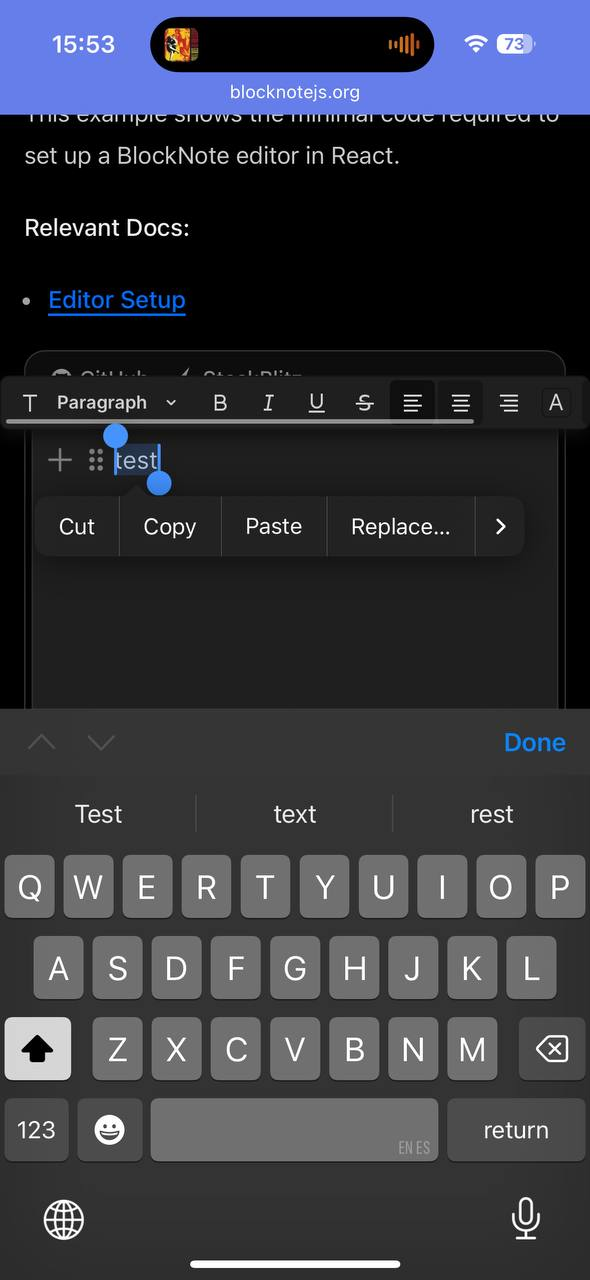
Notion and blocknote both use floating toolbars!
Do you like what you are reading? Subscribe to receive updates.
Unsubscribe anytime